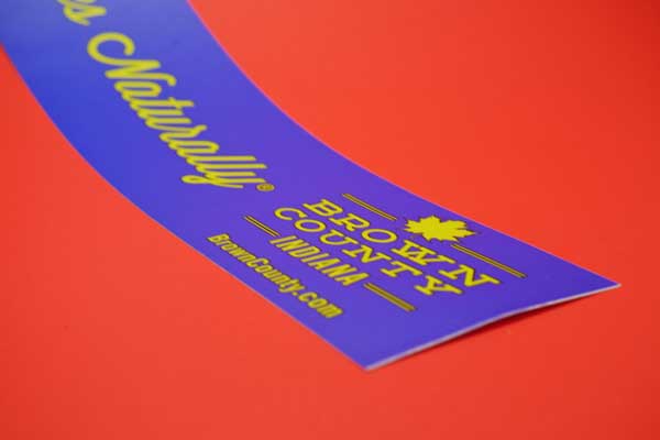
It’s no secret that color has an impact on our emotions. The color green, for example, has a dramatic impact on our productivity because it’s restful for eyes and produces less eye strain when compared to alternatives. Based on that, experts say you should make your computer’s desktop green to help give you that boost you need to get through the day.
But this idea extends far beyond ourselves and can actually make people more or less likely to buy a particular product depending on how a certain colors is used. This is all critical information to keep in mind when you’re designing your labels, because if you understand how certain colors impact buyers you’re in a better position to use that information to your advantage.
Your Label Colors and Your Buyers: Breaking Things Down
Generally speaking, you should always make color choices for your labels based on the specific types of feelings you want someone to associate with your product moving forward. As stated, green is a color known for happiness and relaxation. It also has the potential to reduce someone’s blood pressure, so it’s perfect for health and wellness products and other items that fall into similar categories.
Blue, on the other hand, is known to promote both trust and reliability. This, too, would be a great choice for everything from health and wellness items to fitness products.
If you want to create a sense of urgency for your product, consider using colors like yellow, white and red. All of these have the potential to invoke very strong emotions within someone and if you want to leverage that intensity to stand out from your competitors on a store shelf, this would definitely be how you do it. Note that along the same lines, red is also a great way to invoke fear – as are gray and black.
 Using Colors to Create a Feeling
Overall, you need to think about your color choices based both on the feelings you’re trying to associate your product with, and the ultimate action you want someone to take. Cool colors, for example, tend to appeal to the more responsible, budget-conscious shoppers out there. Certain types of people always remain calm and make thoughtful decisions and color choices like light blue or even pink play right into that. Warmer colors have essentially the opposite impact – red, orange and yellow appeal more to impulse buyers.
Generally speaking, most experts agree that one of the colors you should always try to avoid whenever possible is brown. Nobody is saying that you can’t use brown in your product label when you do so carefully. But overall, brown tends to invoke feelings of passivity, relaxation and sometimes even depression – all things that you probably don’t want people to think about when they’re trying to decide whether to buy your product over someone else’s.
If you’d like to find out more information about how certain colors impact your potential buyers, or if you have any additional questions that you’d like to discuss with someone in a bit more detail, please don’t delay – contact us today.
