
While it’s certainly true that flashy label designs are a great way to attract attention on a crowded store shelf, there’s another theory that tells us essentially the opposite. Instead of playing the game of “who can shout the loudest” with your competitors, minimalist label designs offer a breath of fresh air for customers who are feeling overwhelmed and bogged down by the sheer volume of information they need to digest on a daily basis.
But minimalist label design doesn’t mean leaving anything out. Far from it. It just means that sometimes by saying less in a literal sense, you’re actually conveying so much more in the grand scheme of things. You’re amplifying your marketing message through the strategic use of simplicity, essentially. But if you really want to make sure that you’re leveraging minimalist label design best practices to your advantage, there are a few key things you’ll want to keep in mind.
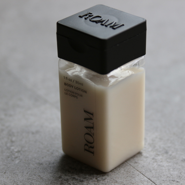
The Major Properties of a Minimalist Design
Quality Product Stands On Own Two Feet
Generally speaking, all successful minimalist product labels have a few key things in common. For starters, they really know how to let the materials stand on their own two feet, so to speak. You’re not throwing “everything and the kitchen sink” at your customers in a desperate attempt to get them to notice you. Instead, you’re serving up one or two core ideas and are letting those concepts speak for themselves.
Design Uses Restraint
Another thing minimalist labels tend to have in common is that they use restraint. Keep in mind that according to one recent study, the average person encounters between 3,000 and 20,000 pieces of marketing per day. It’s also true that your label is nothing if not an advertisement for the product itself. When you don’t practice restraint as effectively as possible, you’re essentially adding to the noise that people have to wade through on a daily basis. You may know beyond the shadow of a doubt that your product can help someone solve a problem or achieve a goal more effectively than anything else – but you’re certainly not communicating that during this most critical of moments.
Less Is More
Overall, what you’re really trying to do here is utilize a “less is more” approach to highlight the raw value that only your product can provide. When you include too much supplementary information on your product label, you run away from this goal instead of towards it.
Nobody knows your product quite like you do – meaning that you’re likely well aware of its unique value proposition. Distill that idea down to a sentence or, better yet, to a small series of visual elements. Then, make those pieces the cornerstone of your design. Every choice you make from that point should support and highlight that value. If something doesn’t do that – even if it’s a picture you really like or a large font that you find particularly attractive – it absolutely needs to go.
If you’d like to find out more information about how to use the properties of minimalist label design to your advantage, or if you just have some additional questions that you’d like to discuss with someone in a bit more detail, please don’t hesitate to contact us today. Call 1-800-777-5528